
Why did we choose these colors? Bôhten frames explained

Bôhten stands out. Period.
Not just because of its unique style, but also because of the thought and care that goes into the design of our frames. From sizing, to materials, to durability, to color, there’s so much research and planning done behind the scenes to ensure each frame suits you best.
You may not know this, but Nana K, Co-founder of Bôhten, is the Lead Designer and Creative Director who works with specialists from around the world to design our frames and bring them to life. Well, we were curious. What’s the deal with the colors? Why did you choose specific ones for certain frames Nana K? (This is exactly how we asked him).
And luckily, he indulged us. Here’s a brief breakdown of why some of our favorite frames are the color they are today:
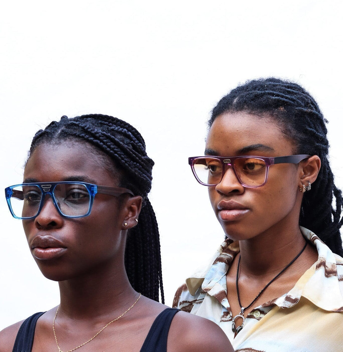
Manyara Marmalade Sun - The lip-smacking frame

The Manyara Marmalade Sun are a part of Bôhten’s latest collection which are specifically designed to fit the faces of Black people comfortably. But, there’s a bit of a story behind its color. Nana K shares that originally, he wanted to try a new color and was looking for a champagne hue to pair with the frame. However, upon receiving the prototype, the color turned out to be more of a light orange, like Marmalade. “It was a pleasant surprise” said the Creative Director and in turn he decided to run with it. Hence, the Manyara Marmalade was born.

Jade Lemon - The story behind the Lemon

Fun fact: The Jade lemon was actually Bôhten’s first yellow frame. Ever. Yellow was chosen because it’s so transient - meaning, it looks great on a variety of skin tones. “If you’re dark skinned it looks great because it gives you a color pop. If you’re Caramel, still a color pop but not as vibrant. It blends and compliments lighter skin as well,” said Nana K when we asked about this frame. It’s well fitted for all skin tones. He says, “It’s the one frame people sleep on because they think it’ll be too colorful, but it’s not.”"It’s a vibrant, refreshing, high energy color” according to Nana and it will bring what needs to be brought to your wardrobe.

Legend Lavender - Peace and Serenity anyone?

Lavender is a color and fragrance that tends to be synonymous with serenity and peace. With the Legend Lavender, we hoped it would do the same. As Nana K rightly points out, “It’s distinct to have a pair of glasses within the color range of purple.” He highlights the fact that the color "...looks really good with fairer skin.” While lavender doesn’t pop as much with darker skin tones, the color for this frame compliments a variety of others, so we encourage you to give it a try.  Barklae ||| Chalbi - A desert unknown

The Barklae ||| Chalbi is named after a small desert located in the northern region of Kenya. The Chalbi frames are an Earth tone color and was chosen because it complements the variety of browns each of our skin has. Nana K confesses the color was “experimental.” The new acetate range allowed him to test out new color ways he didn’t have access to before. He said, “We wanted something that complements all kinds of brown skin. So even when white people tan, the brownness and bronze that they get, this would bring a bit of textual brownness or earth to it.” A frame that compliments the brownness of your skin? That’s definitely a reason to pick this color.
Wakanda Forever Limited Edition Capsule: Moto

A pair from our Wakanda Forever Collection collaboration had to be included in this round up. Designed using Bôhten’s new design blueprint, and inspired by Marvel Studios’ Black Panther: Wakanda Forever, the Moto frame was inspired by Okoye, the fierce General of Wakanda’s armies. Her suit had a fiery red base and was embellished with gold armor, hence these same colors were used to design The Moto. Speaking of fiery, that’s also the meaning of “Moto.” It’s translated from Swahili, a language spoken widely across Eastern Africa. Do you see the resemblance?

Now you have a bit of insight into the color ways for some of our Bôhten designs. We hope that cured your curiosity? It sure did for us! Thank you to Nana K for sharing this information and we look forward to learning more about the behind the scenes process of Bôhten designs.
Do you have any suggestions on colors we can add to our palette for future designs? Let us know what you think would work best by tagging us on socials with #Bohten #BohtenWeSeeYou