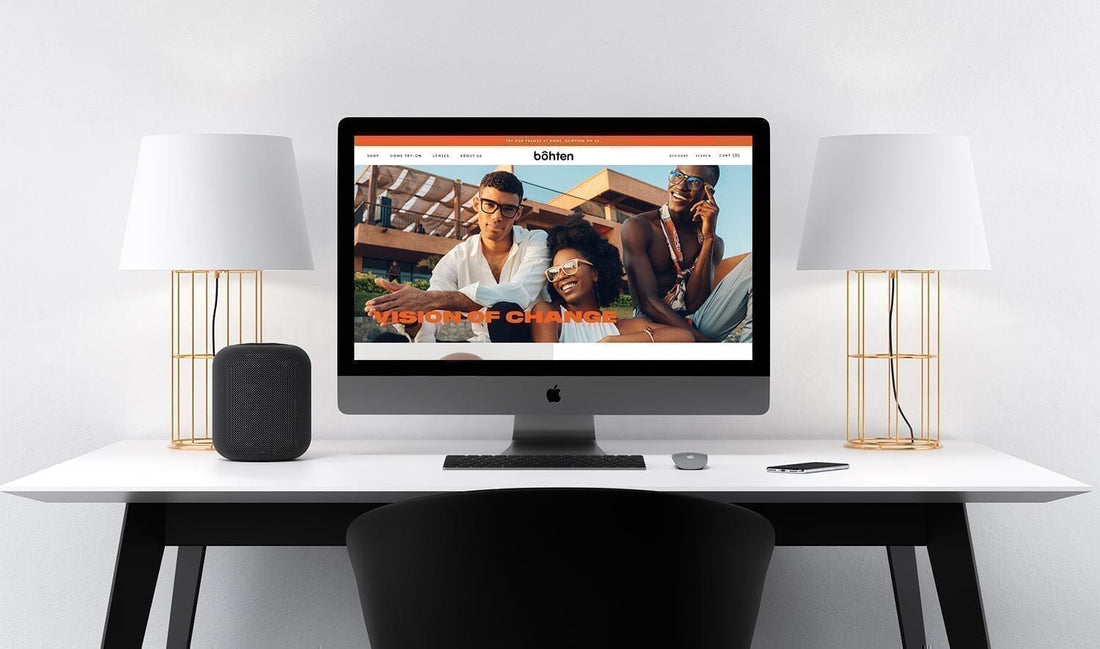
Get Ready to Enjoy your New & Improved Bohten.com Shopping Experience
Share
We are excited to announce the launch of our brand new Bôhten website design! After months of hard work, we have finally brought our vision of a new & improved online shopping experience. All thanks to the highly skilled and innovative team at Q&A Creative based in Orange County, California. With our clean and modern interface design, your discovery and shopping experience will be more delightful than ever!
We sat down with Ritchie Cruz, Creative Director at Q&A Creative, to learn more about the challenges and process that lead to the beautiful website you see today.
Q: What are some of the features of the original website that needed improvement?
Quite a few, but to touch on the main features; the ordering process when selecting the lens and its variants, and Home Try-On program Bohten offers, were designed to give the guest a better user experience.
Q: In 3 words, how would you describe the aesthetic of the new website?
Modern, bold and urban.
Q: What key features should every ecommerce website have?
Good question. Every website will vary in its needs, so it’s hard to pinpoint a specific key feature. The goal of our studio is to find a balance of good UI (User Interface) and UX (User Experience).
Q: What are some of the features on the new e-commerce website that the original site lacked?
The Home Try-On feature was not a part of the original site. We elevated the user experience for Bôhten’s guests when selecting frames for the Try-On Program. Instead of filling out a form, we allowed the guest to view all the frame options, to select 3. Currently, this feature only works for customers in the US and Canada.
Another feature we included is selecting the lenses for your frames. We made it easier not only for Bôhten to manage on the back-end, but also for the guest to make a purchase.
Q: What are some challenges you and your team faced while designing the new website?
In terms of design, the biggest challenge is breaking the content apart where we are separating “direct” vs “informational” content. We wanted to create editorial style pages, especially on pages with a lot of informational content so we can educate the guest more effectively, all while getting a good understanding and feel of the Bôhten brand. Our goal was to find a balance between copy and imagery to make it visually appealing. This helps keep the guest wanting to explore throughout the site, and ultimately make a purchase.
Get ready to explore our new online store at bohten.com! Shop for optical, sunwear, and try our home try on feature to experience the eyewear choices in the comfort of your home. If you have any suggestions or feedback to help us enhance your experience further, let us know by emailing us at info@bohten.com.
